Website resource: Kaffe Fassett and Sophie Digard
I start to create my Website about Crafts design, and I will be compare two website famous designer Kaffe Fassett and Sophie Digard which admire me. This website research will help me understand how I should create my own website, so I will consider the design, colours and typography. How is working navigation and of course the link to the mobile view is also very important.
I will start with the Kaffe Fasset Website. The home page looks very colourful and interesting, the main page show the designer's photo, name and also who he is. When I click About, this page open me many information about his life, interesting story and biography.

Very detailed description, I think it so much information about his life.


The Social Media connects to Facebook, Instagram, Twitter, Pinterest

I then checked the mobile phone website and everything working very well. I can see every page, and click what I looking for without problem, everything is clear.
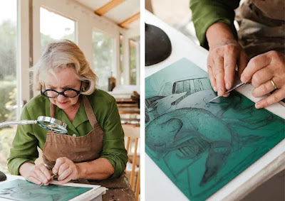
My second website is designer Sofia Digard Website, I start to visit home page, very short information about biography. She is master colourist who can incredible compare crochet raffia tote bag with embroidered and each piece. She's been designing in her Paris studio since 1999, and her work is known for its delicate patterns and beautiful colours. Her works become an inspiration for me to create a new collection of bags


Comparing both sites famous crafter designer I can to say that the first site was a little boring, a lot information about the artist. I think one page about life artist it is fine. The gallery page is very interesting, and all categories have full information about the process. I am thinking about my own site and I need do more images and detail about my work. But I don't like his shop page because large picture, different size, all categories mixed. The second Website was disappoint, because Sophie Digard did not have own Website. The both of designer have social media, and Digard's I like more, her post very clear, interesting, and informative than Kaffe's.
It was good experience for me, I am considering artist who inspire me, and their work. Now I know how it is important have own website, Now I have different ideas how I want to looks my galleries and some ideas by my homepage, make it attractive and interesting for my visitors.

Good you have completed this and compared the two there could be a little more technical detail which would improve this
ReplyDelete